Pages

Tuesday, May 27, 2008

Three beasts on a sofa

3 creatures, 2 tongues

Here's Felis Domesticus, looking especially elegant as she licks herself with her legs splayed. The more attractive creature with its tongue out is by Youngest Brother, who now has his own blog, Campus Crafts. The room he's living in just for the summer looks more put together than many middle-aged, two-income homes, and you can also check out his other sock creatures and bizarre stitched projects for school and fun.

I'll post some updates on my own projects soon, I promise!

Wednesday, May 14, 2008

Moving up in the world

From this...

To this...

In other words, from my White 2037—the ratty slipper of the sewing machine world—to a Pfaff Tiptronic 1171—the sleeker, chunky-heeled sister. Seriously, these are the illustrations in each respective owner's manual. The beslippered foot always seemed to make sewing look a bit frumpy, so leave it to capitalist West Germany to glam up the housework.

I scored the Pfaff at a thrift store a while ago and haven't mentioned it because it's been getting repaired ever since. Just as I got her back, I found the new Zigzaggers blog (via Craftzine), so I sent in a review of the 1171. Check it out to hear me gushing, and take a look at all the beautiful secondhand machines other people have written about.

Pfaff Tiptronic 1171

Sunday, May 04, 2008

People Fabric watching

People Watching fabric

Have you been reading True Up? It's a fairly new blog by Kim from Dioramarama that feeds us fabric junkies. Her posts are gleefully frequent, and I can't get enough.

It didn't take long after she'd starting posting a Daily Swatch that I lost control and shelled out for this People Watching print (pictured above, now that I've got it in my hot little hands!) from Revival Fabrics. It felt like a lot to spend because scoring so much vintage fabric for pennies at thrift stores and the like, but it all evens out.

I love to ogle vintage fabric online, but this is the first time I've bought. Why? Because the People Watching fabric wasn't just gorgeous, it was also exactly what I've been looking for. At left is one of the bargaintastic fabrics I found several months ago at my quilt guild's show (before I joined, in fact). Though it may not actually be old enough to qualify as "vintage," the various people hanging out of the windows looked cool in a voyeuristic, Rear Window way. It inspired a couple quilt designs, but finding fabrics to go with it has been tricky. Enter People Watching. The somewhat mismatched colours should pair even better as the slightly abstracted sides of city buildings.

Of course, the fabric-devouring beast is never satiated, so now I've got my eye out for even more window prints. And probably will till the day I die. Isn't that always the way? Even after you've quilted, bound, and finished a project, you can't help but continue to see fabrics that would have been perfect for it.

Must dump all the other great vintage fabric I'm scrounging onto Flickr. Will let you know when I do.


Friday, May 02, 2008

Behold, the satin stitch!

fabric painting by Françoise Schneider
from Marie-Janine Solvit, Pictures in Patchwork (1976)

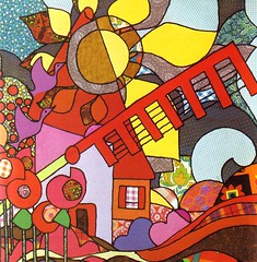
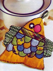
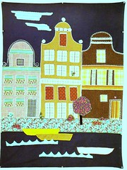
No, the image above is not a screengrab from the latest Yellow Submarine–inspired cartoon psychedelia—it's an appliquéd fabric painting. This is what I'm talking about when I mentioned the power of the satin stitch. I'm completely in love with this picture just because it's so gorgeous, but it's also a great demonstration of the utility of boundary lines in appliqué. I do enjoy the look and practice of a nice lineless needle-turn, but there are times when strong satin stitching makes a greater statement. Want more proof? Keep reading. (Hover over the pictures for artists' names; click on the images to see them bigger.)


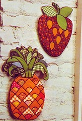
Here are a couple more examples of using black satin stitching to define the edges of appliqué patches. Without the dark line, there wouldn't be enough contrast between the orange prints in the pineapple. It's easy to describe this type of work as cartoony—and I mean that as an aesthetic statement rather than a value judgment—but that neglects the effect of printed fabric, not something that usually crops up in the outlines of Scooby Doo, Space Ghost, or others in the cartoon pantheon. Spectacular, I say.

Floral Bouquet skirt
from Alfred Allan Lewis, The Mountain Artisans Quilting Book (1973)

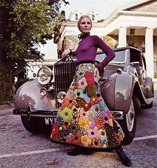
Speaking of patterned prints in satin-stitch appliqué... I wish dames like this would dramatically prop themselves against the Bentleys that litter my neigbourhood. I'm picturing the start of Saturday Night Fever, with madame here stepping out of the car as the first beat of "Stayin' Alive" hits. I suspect it's more elegant in my head than it would be in reality, as actually exiting a vehicle wearing that thing would likely be a challenge. There's a pattern for a quilt with a similar floral design in another book I have, but what woman does not need this skirt in her wardrobe?


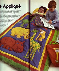
Anyway, back to sewing. Contrasting stitching doesn't have to be black. For this sleeping bag, the stitches around each the green giraffe match its contrasting yellow spots, while the yellow monkey gets more of a tan tint with red stitching—a limited colour palette gets stretched through the stitching.

fabric scene by Geneviève Deronzière Shooting Star by Nancy Freeman
(L) from Marie-Janine Solvit, Pictures in Patchwork (1976); (R) from Sunset Books, Stitchery: Embroidery, Appliqué, Crewel (1974)

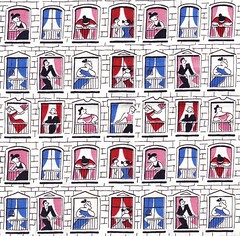
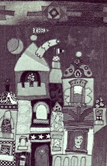
Satin stitching is also useful for areas of fine, straight detail, as in these architectural fabric paintings.

For Sally by Anidelle Flint
from Jean Ray Laury, Quilts & Coverlets (1970)

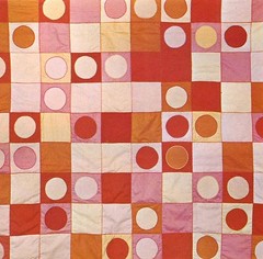
Of course, it's not just representational work that stands to gain from satin stitching. I love the way the lines around the circles and squares in this quilt get an extra dimension from the contrasting thread, sometimes lighter than the ground, sometimes darker. It's a brilliant touch in a quilt that already emphasizes a scattered layout.

Complementary satin stitching can be handy I suppose, but generally I would pick a satin stitch when I want it to stand out rather than recede. In any case, the other great virtue of this type of appliqué is not having to turning edges under. I suspect needle-turn appliqué will always be my standard method, but it's good to know what the benefits of the other options are.

Related: