No, the image above is not a screengrab from the latest Yellow Submarine–inspired cartoon psychedelia—it's an appliquéd fabric painting. This is what I'm talking about when I mentioned the power of the satin stitch. I'm completely in love with this picture just because it's so gorgeous, but it's also a great demonstration of the utility of boundary lines in appliqué. I do enjoy the look and practice of a nice lineless needle-turn, but there are times when strong satin stitching makes a greater statement. Want more proof? Keep reading. (Hover over the pictures for artists' names; click on the images to see them bigger.)
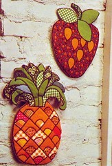
Here are a couple more examples of using black satin stitching to define the edges of appliqué patches. Without the dark line, there wouldn't be enough contrast between the orange prints in the pineapple. It's easy to describe this type of work as cartoony—and I mean that as an aesthetic statement rather than a value judgment—but that neglects the effect of printed fabric, not something that usually crops up in the outlines of Scooby Doo, Space Ghost, or others in the cartoon pantheon. Spectacular, I say.
from Alfred Allan Lewis, The Mountain Artisans Quilting Book (1973)
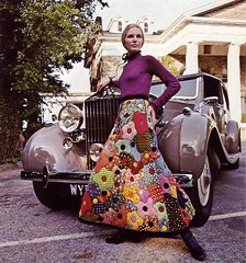
Speaking of patterned prints in satin-stitch appliqué... I wish dames like this would dramatically prop themselves against the Bentleys that litter my neigbourhood. I'm picturing the start of Saturday Night Fever, with madame here stepping out of the car as the first beat of "Stayin' Alive" hits. I suspect it's more elegant in my head than it would be in reality, as actually exiting a vehicle wearing that thing would likely be a challenge. There's a pattern for a quilt with a similar floral design in another book I have, but what woman does not need this skirt in her wardrobe?
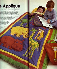
Anyway, back to sewing. Contrasting stitching doesn't have to be black. For this sleeping bag, the stitches around each the green giraffe match its contrasting yellow spots, while the yellow monkey gets more of a tan tint with red stitching—a limited colour palette gets stretched through the stitching.
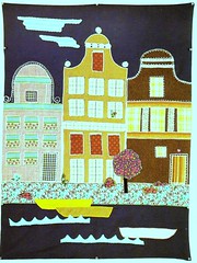
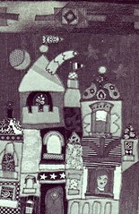
(L) from Marie-Janine Solvit, Pictures in Patchwork
Satin stitching is also useful for areas of fine, straight detail, as in these architectural fabric paintings.
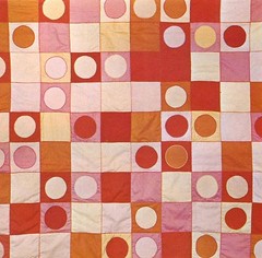
Of course, it's not just representational work that stands to gain from satin stitching. I love the way the lines around the circles and squares in this quilt get an extra dimension from the contrasting thread, sometimes lighter than the ground, sometimes darker. It's a brilliant touch in a quilt that already emphasizes a scattered layout.
Complementary satin stitching can be handy I suppose, but generally I would pick a satin stitch when I want it to stand out rather than recede. In any case, the other great virtue of this type of appliqué is not having to turning edges under. I suspect needle-turn appliqué will always be my standard method, but it's good to know what the benefits of the other options are.
Related:
- More from my vintage quilting books
- Simulating satin stitching in EQ6
- More scans from the amazing Pictures in Patchwork book on Hillary Lang's Wee Wonderfuls

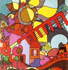
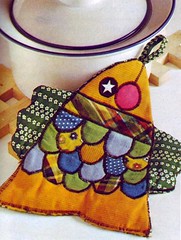
1 comment:
I also own the Mountain Artisans quilt book and am considering trying one of these skirts out, even if just for a laugh. They're fantastic in they're own 70s peasant way.
Post a Comment